Graphing for Mortals
A month or so ago I was at the Future of Web Apps conference listening to Cal Henderson talk about lessons he's learned from building Flickr. (You can snag audio of his talk and his powerpoint slides at the FOWA site.) One of his slides mentioned graphing the hell out of everything so you can get a visual sense of what's happening with your application. He mentioned Cacti as a great app for visualization. I took a look at it, but it looked so complex that I dismissed it as a tool for large-scale apps.
I manage a very small setup with a couple of servers. But I've never been able to get a good "snapshot" of what's happening. I've been relying on server logs (analyzed with analog) and Google Analytics. Analog does nice text reporting, but isn't strong on graphs. And Google Analytics is always a couple days behind. My ISP doesn't offer bandwidth usage reports, and I've had to take their word on usage. So I completely understand Cal's point about getting a handle on what's happening on your servers.
When I got back from SF, I decided to bite the bullet and learn how to graph this stuff. And after a month or so, I finally have some nice graphs giving me a better sense of what's happening on my servers right now. I thought I'd share my personal crash course in graphing stuff, in case anyone else out there manages their own servers and doesn't have a web ops department.
Step 1: Learn RRDtool. heh, well, at least get to the point where you understand what round-robin databases are and how to create graphs from that data. I knew I'd read about RRDtool somewhere before, and sure enough Hack #62 in Spidering Hacks is called Graphing Data with RRDtool. It showed how to graph the Amazon sales rank of a book over time. I followed the example, and then tweaked it a bit to track books I'm interested in. I came up with this:
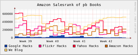
Lower is better on this graph.
So on a daily basis I can see how the books I've helped put together are doing on Amazon, and then step back and get the view over several weeks. (Not always a good thing.) I also put together graphs of individual books, plotted a couple books together, and generally learned how to control RRDtool graphs a little. Knowing a bit about RRDtool helps a ton once you get to step 3.
(And speaking of books, I really wanted a book about graphing with RRDtool at this point. It seems that whenever I want to tackle a technology that is new to me, I want to run away from my computer and sit down somewhere with a book—coming back to the computer armed with more info. There aren't any books specifically about RRDtool, and I think a great PDF that explains some of the high-level concepts would be an improvement over the current documentation that focuses on walk-throughs.)
Step 2: Learn SNMP. Again, impossible to tackle in a few days, but you can get the gist of it fairly quickly. SNMP is a protocol for monitoring network equipment. I grabbed Net-SNMP and followed the tutorials for configuring it. I especially found the tool snmpwalk helpful for making sure everything was up and running properly.
I should probably pick up Essential SNMP. I looked at it in a bookstore, and quickly scanned the chapter about RRDtool and Cricket. I realized that I should be using a front-end for creating graphs instead of hand-coding monster RRDtool command lines. Which led me to...
Step 3: Install Cacti. Cacti is a PHP/MySQL application for generating graphs with RRDtool and SNMP. You can use some built-in templates for tracking network usage, or create your own data sources with some simple scripts. Once you see how tedious it is to create your own RRDtool graphs, you'll appreciate how quickly you can build graphs with Cacti.
I'm running Cacti on Windows, and it took a while to get everything configured properly. Here are some essential tips that I picked up from the forums if you're in the same boat:
There's also a bunch of data sources and graph templates that the Cacti users share in the forums. Take a look at this post: Complete List of Cacti Scripts and Templates to get a sense of what's available. I plugged in a WMI SQL Server monitor, and it just worked without much fiddling around.
I also recommend running the app in debug mode. As you create graphs, take a look at the RRDtool commands that generate the graphs. You'll start to get a better feel for RRDtool simply through osmosis. And if you took the time to learn about RRDtool in Step 1, seeing the raw commands helps you diagnose problems with your graphs.
So what I've ended up with after all of this work is a page filled with pretty graphs like this, giving me a look at what's happening on my servers and my sites in real time:
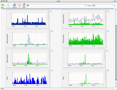
These graphs have been scrubbed a bit.
I'm just beginning my data visualization journey, but I can already tell this going to help me make decisions going forward. (Thanks, Cal!) There's something about seeing information in a graph that makes it more concrete than numbers flowing by in a log. This step into the arcane world of network graphing already has me thinking about the real world differently. I'm walking around looking at things thinking, "I could graph that!"
I manage a very small setup with a couple of servers. But I've never been able to get a good "snapshot" of what's happening. I've been relying on server logs (analyzed with analog) and Google Analytics. Analog does nice text reporting, but isn't strong on graphs. And Google Analytics is always a couple days behind. My ISP doesn't offer bandwidth usage reports, and I've had to take their word on usage. So I completely understand Cal's point about getting a handle on what's happening on your servers.
When I got back from SF, I decided to bite the bullet and learn how to graph this stuff. And after a month or so, I finally have some nice graphs giving me a better sense of what's happening on my servers right now. I thought I'd share my personal crash course in graphing stuff, in case anyone else out there manages their own servers and doesn't have a web ops department.
Step 1: Learn RRDtool. heh, well, at least get to the point where you understand what round-robin databases are and how to create graphs from that data. I knew I'd read about RRDtool somewhere before, and sure enough Hack #62 in Spidering Hacks is called Graphing Data with RRDtool. It showed how to graph the Amazon sales rank of a book over time. I followed the example, and then tweaked it a bit to track books I'm interested in. I came up with this:
Lower is better on this graph.
So on a daily basis I can see how the books I've helped put together are doing on Amazon, and then step back and get the view over several weeks. (Not always a good thing.) I also put together graphs of individual books, plotted a couple books together, and generally learned how to control RRDtool graphs a little. Knowing a bit about RRDtool helps a ton once you get to step 3.
(And speaking of books, I really wanted a book about graphing with RRDtool at this point. It seems that whenever I want to tackle a technology that is new to me, I want to run away from my computer and sit down somewhere with a book—coming back to the computer armed with more info. There aren't any books specifically about RRDtool, and I think a great PDF that explains some of the high-level concepts would be an improvement over the current documentation that focuses on walk-throughs.)
Step 2: Learn SNMP. Again, impossible to tackle in a few days, but you can get the gist of it fairly quickly. SNMP is a protocol for monitoring network equipment. I grabbed Net-SNMP and followed the tutorials for configuring it. I especially found the tool snmpwalk helpful for making sure everything was up and running properly.
I should probably pick up Essential SNMP. I looked at it in a bookstore, and quickly scanned the chapter about RRDtool and Cricket. I realized that I should be using a front-end for creating graphs instead of hand-coding monster RRDtool command lines. Which led me to...
Step 3: Install Cacti. Cacti is a PHP/MySQL application for generating graphs with RRDtool and SNMP. You can use some built-in templates for tracking network usage, or create your own data sources with some simple scripts. Once you see how tedious it is to create your own RRDtool graphs, you'll appreciate how quickly you can build graphs with Cacti.
I'm running Cacti on Windows, and it took a while to get everything configured properly. Here are some essential tips that I picked up from the forums if you're in the same boat:
- Enable the SNMP and sockets extensions in php.ini.
- Disable strict mode in MySQL's my.ini.
- Use Cacti-approved builds of RRDtool.
- Stroll through the Cacti db to get a sense of what's happening.
- The Cacti log file is useful. Go there first if you're having a problem.
There's also a bunch of data sources and graph templates that the Cacti users share in the forums. Take a look at this post: Complete List of Cacti Scripts and Templates to get a sense of what's available. I plugged in a WMI SQL Server monitor, and it just worked without much fiddling around.
I also recommend running the app in debug mode. As you create graphs, take a look at the RRDtool commands that generate the graphs. You'll start to get a better feel for RRDtool simply through osmosis. And if you took the time to learn about RRDtool in Step 1, seeing the raw commands helps you diagnose problems with your graphs.
So what I've ended up with after all of this work is a page filled with pretty graphs like this, giving me a look at what's happening on my servers and my sites in real time:
These graphs have been scrubbed a bit.
I'm just beginning my data visualization journey, but I can already tell this going to help me make decisions going forward. (Thanks, Cal!) There's something about seeing information in a graph that makes it more concrete than numbers flowing by in a log. This step into the arcane world of network graphing already has me thinking about the real world differently. I'm walking around looking at things thinking, "I could graph that!"