I really enjoyed this essay about perceived efficiency and complexity. Especially with the Chesterton’s Fence kicker. Understanding an existing system before changing it is important.
design

I love the Paris summer olympics logo and type design. I’m a pushover for deco inspired type. Even though I know it’s the Mini Cooper move of forming fonts it always strikes me as hopeful future. And compared with some of the goofy Olympic logos of the past, this one is playful and clever.
Have I mentioned how much I like the Micro.blog layout? This is their discover page that shows recent updates. So clean. No like counts. No ‘share this’ button. No ads. No calls to add a comment or sign up or subscribe or download the app or turn on notifications. More like this please.
I really enjoyed this conversation between Jeff Veen and Mike Monteiro discussing Ruined by Design. There's nothing like hearing from two Internet Olds™ who watched the Web appear and had their idealism about it crushed in many ways. (And I say that affectionately as an Internet Old who has had crushed idealism.) They also discussed Chris Wetherell's remorse about automating retweets. There has been a lot of regret floating around lately. Tim Carmody called it The Builder's Remorse:
"This is the builder’s remorse. Not that you invented a thing, not that the consequences were unforeseen. It’s that you gave the thing to a power structure where things were overwhelmingly likely to end in ruin."Web development as punk rock was a lot of fun for certain segments of the population. Now it's time to nurse our hangovers, clean up the garbage, and turn it into a profession. Mike Monteiro says it much better than that though which is why you should get his book if you haven't yet.

Field Notes really knocked this National Parks edition out of the, um, recreation enclosure. If you don't already have stacks of these nicely designed notebooks this edition would be a good place to start.
I really enjoyed this history lesson / manifesto / questioning. (lesfesquesto?) As the author says, "I find that both building and designing is a constant cycle of having a question and trying to find the answer." This offers some interesting questions including: what potentially important ideas have we forgotten and how can we use computers to iterate faster?
This is a fun font based on physical router templates that the national forest service uses to carve wooden signs. The great discussion at MetaFilter has some more context and also pointed to the similarly inspired Routed Gothic.

Wow, this is some awful antisocial behavior from a company (and marketing firm) that should know better. Can we have one or two ad-free spaces?

I’m impressed with these campaign brand guidelines which are fairly complex but conveyed clearly. The font is strong—I’m happy dems have moved away from serif fonts. Don’t miss the hand lettered state names.
I also enjoyed this review of the brand at Brand New: Water Under the Bridge.
I also enjoyed this review of the brand at Brand New: Water Under the Bridge.
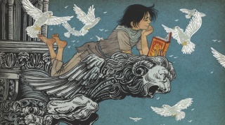
Need some design inspiration? This is a great collection of comic book covers from 2018. I added quite a few to my list of comics to find. It also reminded me that I loved the disorienting Why Art? from earlier this year and I don't think I mentioned it here.
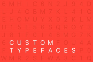
This post by Arun Venkatesan discusses why companies are designing custom—though very similar—typefaces. It's also a quick history of digital typography. [via Tecznts]
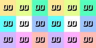
If you work in a pixel-adjacent industry, you'll enjoy this newsletter by Kai Brach who produced Offscreen Magazine. This newsletter recently changed its name from Offscreen but it's the same focus: humane design & developer news. Kai also recently wrote a behind-the-scenes look at producing DD: A look behind Dense Discovery: creating a fully customised weekly newsletter.